Custom Dashboards Guide
Custom dashboards allow you to organize and view multiple analyses simultaneously during your meetings. You can create layouts that group related analyses together and customize how they're displayed.
Understanding Custom Dashboards
A dashboard consists of sections, where each section:
- Has a descriptive name to group related analyses
- Can be configured with different layouts (columns and row heights)
- Contains analysis panels that can be dragged and arranged
Creating a Custom Dashboard
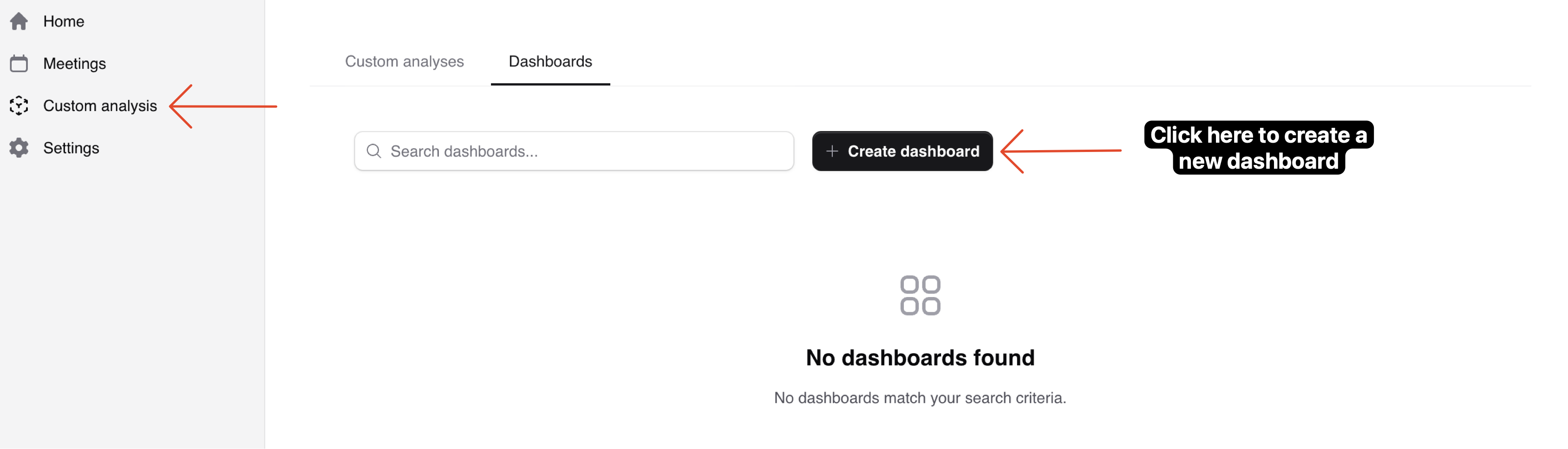
1Access Dashboard Creation
Navigate to the "Custom Analysis" tab in the sidebar, then select the "Dashboards" sub-tab. Click the "Create Dashboard" button to begin.
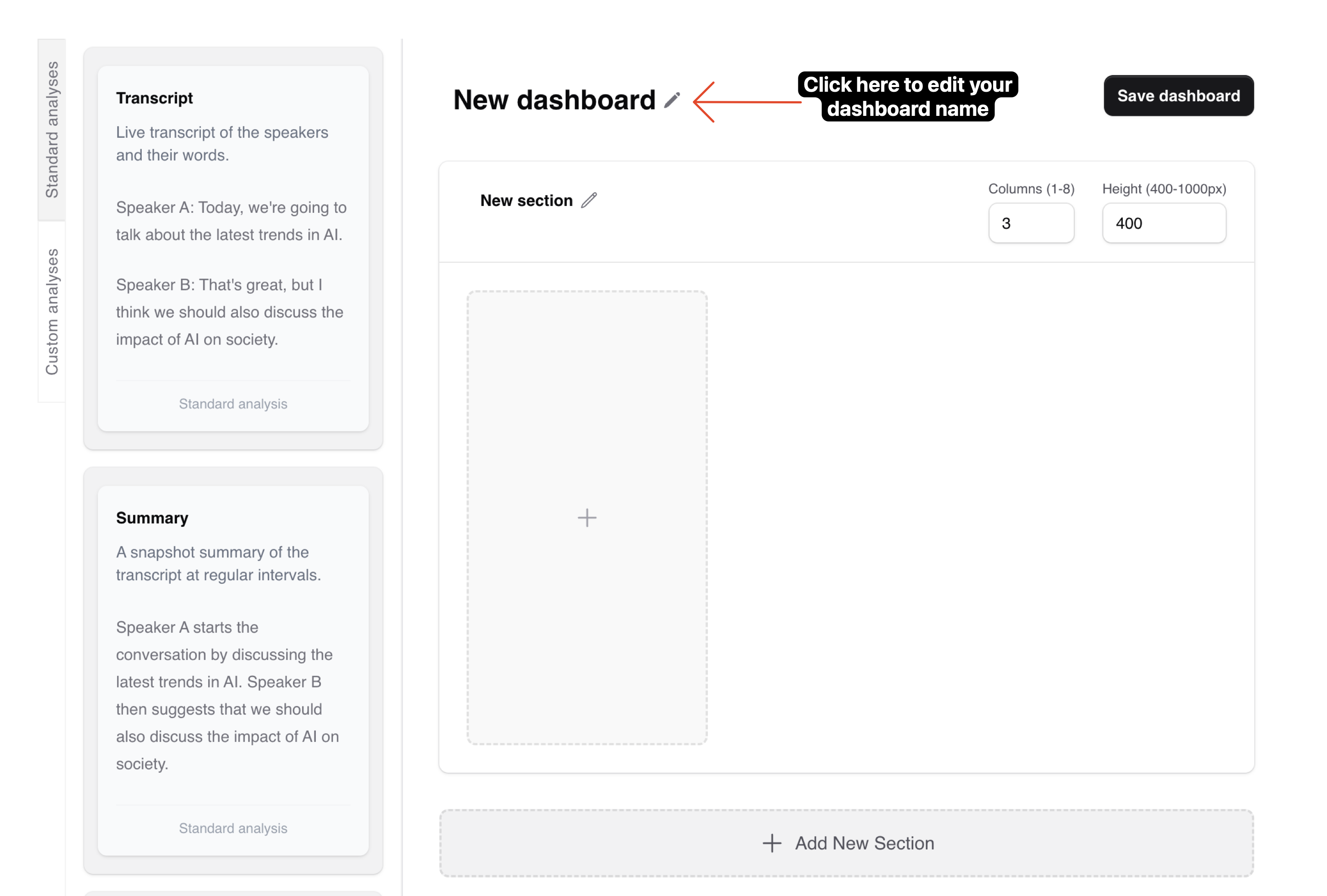
2Name Your Dashboard
Give your dashboard a descriptive name. This name will be used to identify the dashboard when attaching it to meetings.
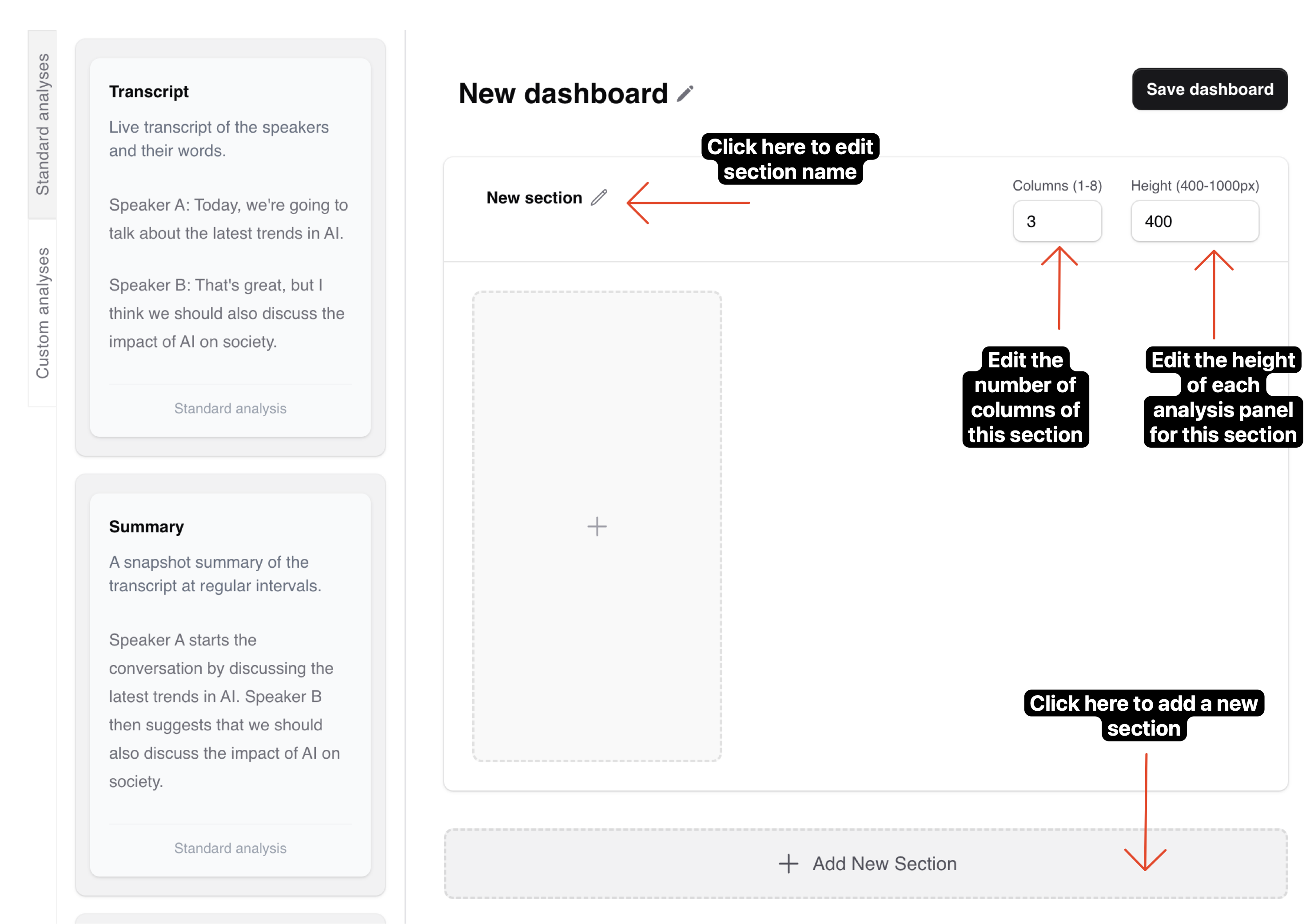
3Creating Sections
Sections help organize your analyses into logical groups. For each section, you can configure:
- Section name (e.g., "Meeting Overview", "Action Tracking")
- Number of columns - determines how many analyses appear side-by-side
- Row height - controls how tall each analysis panel appears
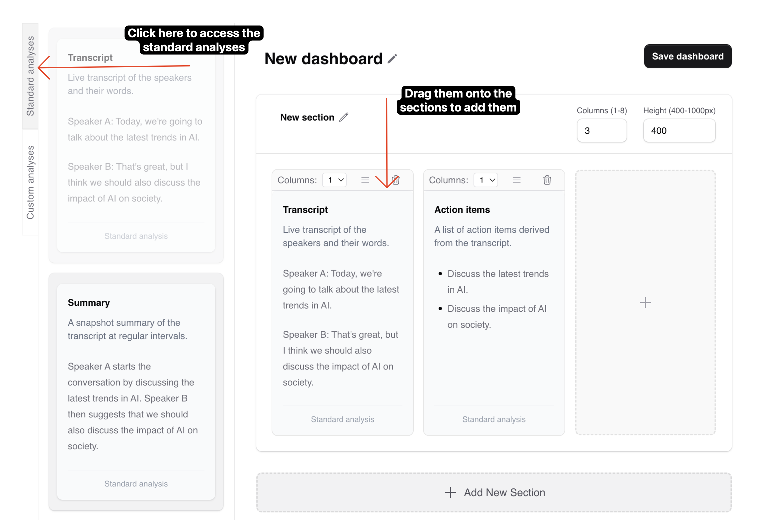
4Adding Standard Analyses
Standard analyses are pre-built, ready-to-use analyses that come with the platform - no setup required. To add them to your dashboard:
- Expand the Standard Analyses panel in the left sidebar
- Drag and drop any of these built-in analyses into your sections:
- Live Transcript
- Summary So Far
- Action Items Mentioned
- Meeting Topics (High-level Timeline)
- Meeting Participants
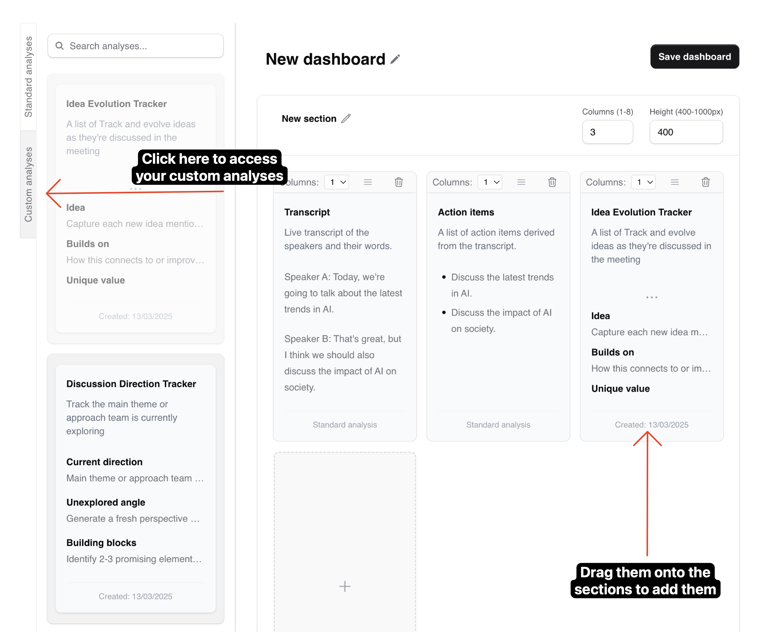
5Adding Custom Analyses
To add your custom analyses:
- Expand the Custom Analyses panel in the left sidebar
- Browse through your previously created custom analyses
- Drag and drop them into your desired section
Customizing Your Dashboard
1Arranging Analyses
You can customize how analyses are displayed within sections:
- Drag analyses between different sections to reorganize them
- Adjust an analysis panel's width by setting the "Columns:" property:
- Panels can span multiple columns up to the section's total width
- The width will snap to column boundaries
Consider grouping related analyses together in the same section. For example, put all participant-related analyses in one section and action item tracking in another.
Saving Your Dashboard
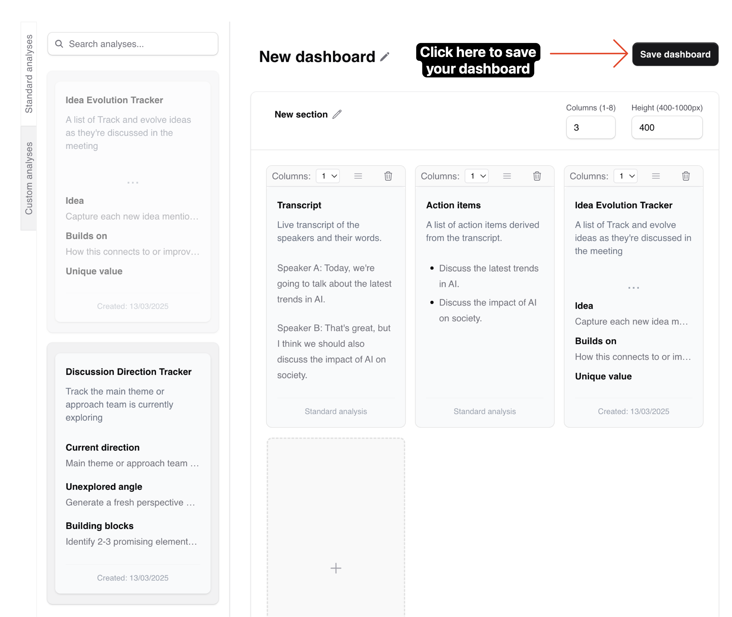
1Save Your Dashboard
Once you're happy with your dashboard, click the "Save dashboard" button to save it.
Best Practices
- Start with the most important information in the top sections
- Use consistent column layouts within sections for visual clarity
- Consider screen size when setting the number of columns
- Group related analyses together for better organization
Too many sections or analyses can make your dashboard overwhelming. Focus on the most important information you need during your meetings.
